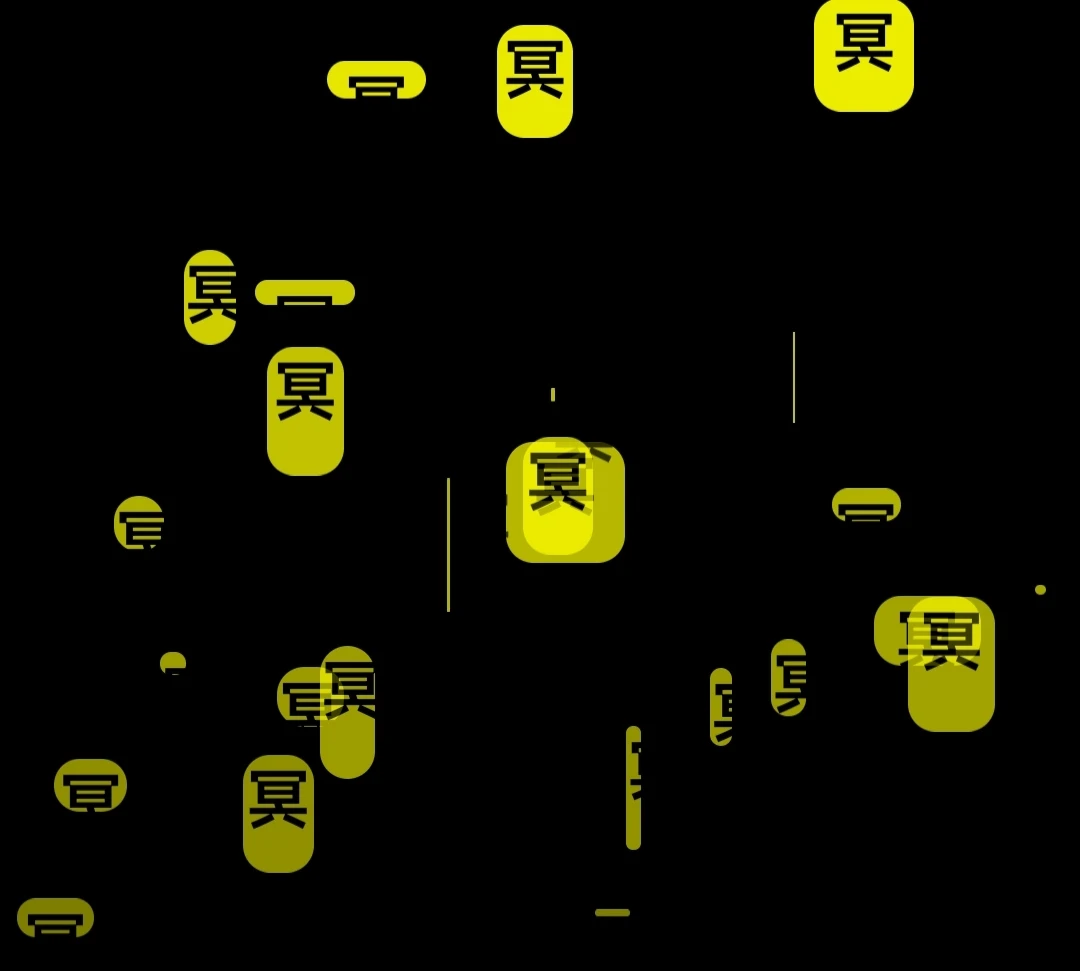
不断下落的“冥”字幕。该特效绝对是小归客原创。 AI写的,日常调教。
没有加个“气氛音乐”。真可惜。
可以复制后用这个看看效果:在线运行html
<!DOCTYPE html>
<html lang="en">
<head>
<meta charset="UTF-8">
<meta name="viewport" content="width=device-width, initial-scale=1.0">
<title>小归客-冥字幕</title>
<style>
  body, html {
    margin: 0;
    padding: 0;
    width: 100%;
    height: 100%;
    overflow: hidden;
  }
  .gradient-background {
    background: linear-gradient(to bottom, black 0%, black 100%);
    position: absolute;
    width: 100%;
    height: 100%;
  }
  .falling-block {
    position: absolute;
    background-color: yellow;
    color: black;
    font-size: 24px;
    font-weight: bold;
    text-align: center;
    border-radius: 10px;
    opacity: 0.8;
  }


  .semi-transparent-box {
    position: fixed;
    bottom: 0;
    left: 0;
    width: 100%;
    padding: 20px;
    box-sizing: border-box;
    background-color: rgba(255, 255, 255, 0.8); /* 半透明背景 */
    box-shadow: 0 -2px 5px rgba(0, 0, 0, 0.1); /* 阴影效果 */
    font-size: 18px;
    text-align: center;
  }
</style>
</head>
<body>

<div class="gradient-background"></div>
<div class="semi-transparent-box">
  半离半合半心怨,<br>
  半俗半禅半随缘。<br>
  人生一半在于我,<br>
  另外一半在于天。<br>
  都是黄泉预约客,<br>
  何苦为难每一天。
</div>
<script>
  // 创建方块的数量
  const numberOfBlocks = 50;

  // 创建方块并添加到页面
  function createFallingBlocks() {
    for (let i = 0; i < numberOfBlocks; i++) {
      const block = document.createElement('div');
      block.classList.add('falling-block');
      block.textContent = '冥';
      block.style.left = Math.random() * 100 + 'vw';
      block.style.width = Math.random() * 50 + 'px';
      block.style.height = Math.random() * 50 + 'px';
      block.style.top = '-50px'; // 初始位置在屏幕外
      block.style.animation = `fall ${Math.random() * 5 + 2}s linear infinite`;
      document.body.appendChild(block);
    }
  }

  // 定义方块飘落的动画
  function fall() {
    const keyframes = `
      0% {
        transform: translateY(0);
        opacity: 1;
      }
      100% {
        transform: translateY(100vh);
        opacity: 0;
      }
    `;
    const style = document.createElement('style');
    style.innerHTML = `
      @keyframes fall {
        ${keyframes}
      }
    `;
    document.head.appendChild(style);
  }

  // 调用函数
  fall();
  createFallingBlocks();
</script>

</body>
</html>
这家伙太懒了,什么也没留下。
给楼主投上 1 枚硬币
当前您的硬币余额:0
